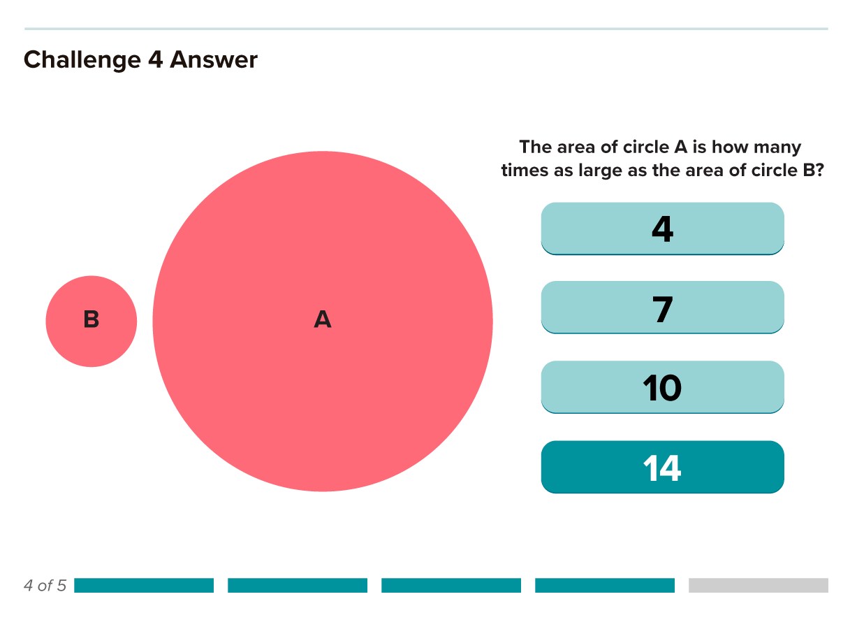
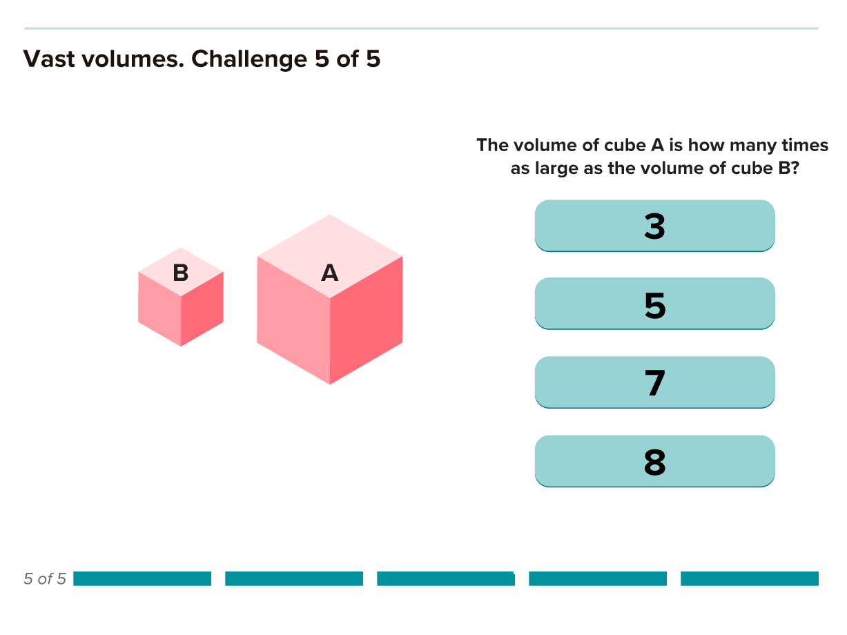
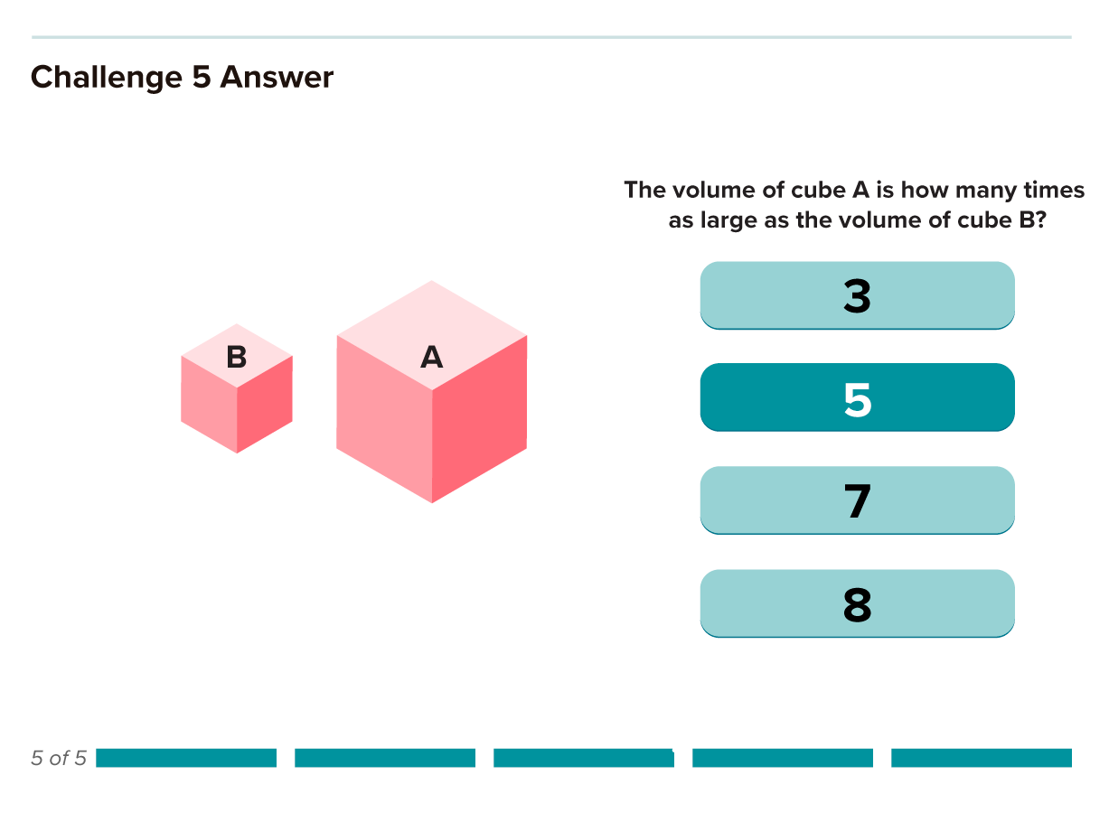
Imagine a science textbook without images. No charts, no graphs, no illustrations or diagrams with arrows and labels. The science would be a lot harder to understand.
That’s because humans are visual creatures by nature. People absorb information in graphic form that would elude them in words. Images are effective for all kinds of storytelling, especially when the story is complicated, as it so often is with science. Scientific visuals can be essential for analyzing data, communicating experimental results and even for making surprising discoveries.
Visualizations can reveal patterns, trends and connections in data that are difficult or impossible to find any other way, says Bang Wong, creative director of MIT’s Broad Institute. “Plotting the data allows us to see the underlying structure of the data that you wouldn’t otherwise see if you’re looking at a table.”
And yet few scientists take the same amount of care with visuals as they do with generating data or writing about it. The graphs and diagrams that accompany most scientific publications tend to be the last things researchers do, says data visualization scientist Seán O’Donoghue. “Visualization is seen as really just kind of an icing on the cake.”
As a result, science is littered with poor data visualizations that confound readers and can even mislead the scientists who make them. Deficient data visuals can reduce the quality and impede the progress of scientific research. And with more and more scientific images making their way into the news and onto social media — illustrating everything from climate change to disease outbreaks — the potential is high for bad visuals to impair public understanding of science.
The problem has become more acute with the ever-increasing amount and complexity of scientific data. Visualization of those data — to understand as well as to share them — is more important than ever. Yet scientists receive very little visualization training. “The community hasn’t by and large recognized that this is something that really is needed,” says O’Donoghue, of the University of New South Wales and lead author of a paper about biomedical data visualization in the 2018 Annual Review of Biomedical Data Science.
There are signs of progress, however. At least two annual conferences dedicated to scientific data visualization have sprung up in the last decade. And the journal Nature Methods ran a regular column from 2010 to 2016 about creating better figures and graphs, which was then adapted into guidelines for scientists submitting papers to that journal. But so far, few scientists are focusing on the problem.
Improving scientific visualization will require better understanding of the strengths, weaknesses and biases of how the human brain perceives the world. Fortunately, research has begun to reveal how people read, and misread, different kinds of visualizations and which types of charts are most effective and easiest to decipher. Applying that knowledge should lead to better visual communication of science.
“We have a lot of practical knowledge about what works and what doesn’t,” says computer scientist Miriah Meyer of the University of Utah. “There are a lot of principles that have been through the test of time and have been shown over and over again to be really effective.”
Chart choice
The human visual system evolved to help us survive and thrive in the natural world, not to read graphs. Our brains interpret what our eyes see in ways that can help us find edible plants among the toxic varieties, spot prey animals and see reasonably well in both broad daylight and at night. By analyzing the information we receive through our eyes to serve these purposes, our brains give us a tailored perception of the world.
In the early 1980s, Bell Labs statisticians William Cleveland and Robert McGill began researching how the particulars of human perception affect our ability to decipher graphic displays of data — to discover which kinds of charts play to our strengths and which ones we struggle with. In a seminal paper published in 1984 in the Journal of the American Statistical Association, Cleveland and McGill presented a ranking of visual elements according to how easily and accurately people read them.
People are better at discerning subtleties in some types of visuals than others — the length of two lines, for example, or the direction of a line are easier to tell apart than shades of gray or the intensity of a color. Studies show that graphs using visual elements high on this list are easier to read and more effective than those near the bottom.
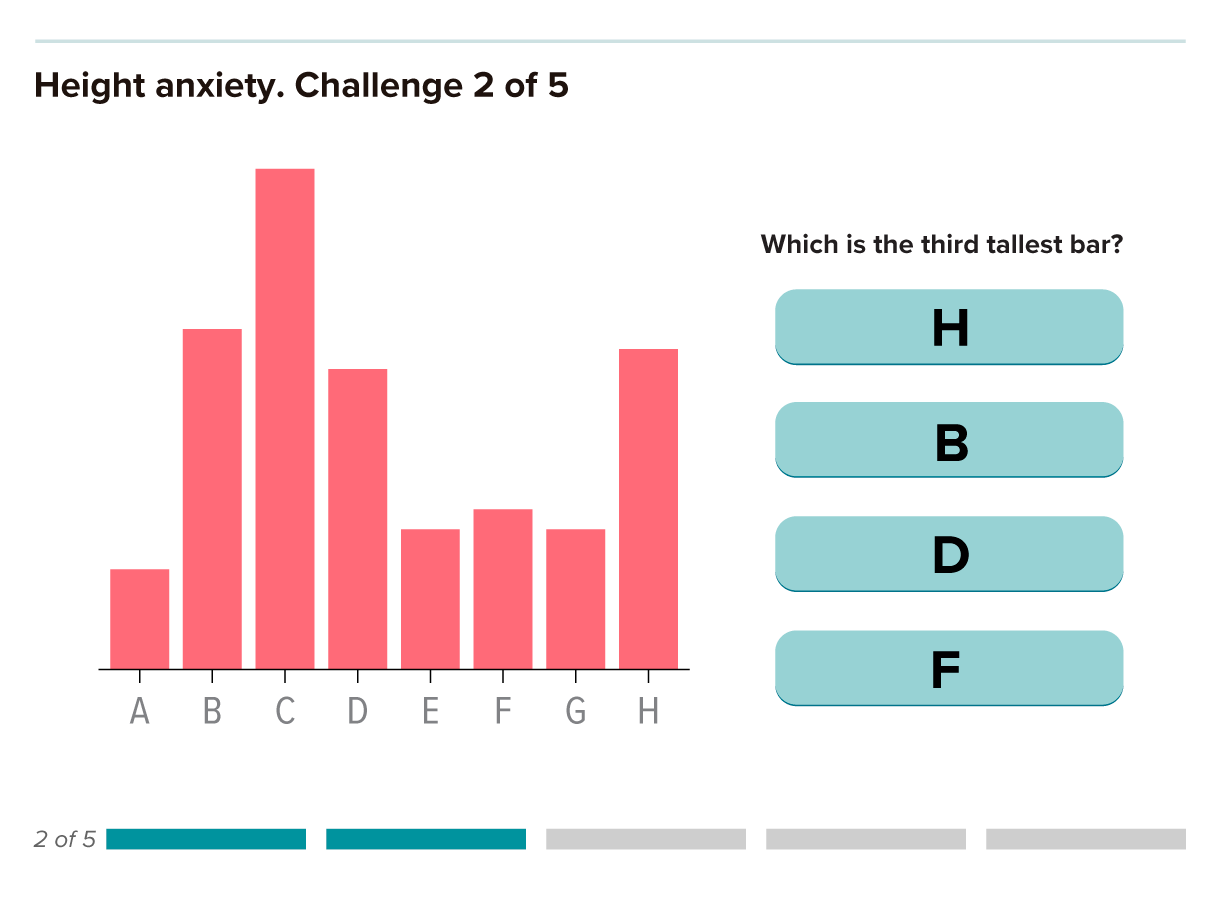
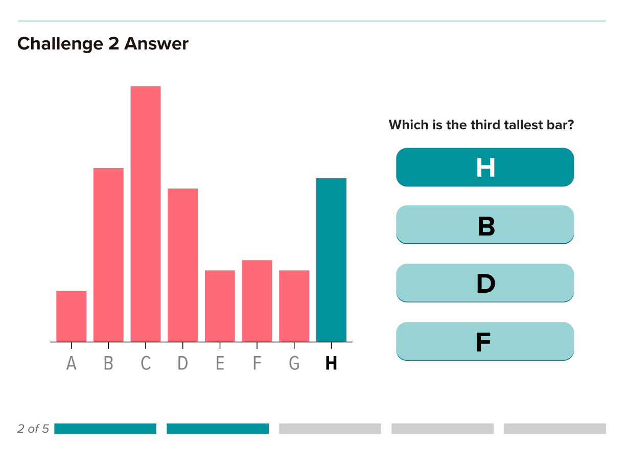
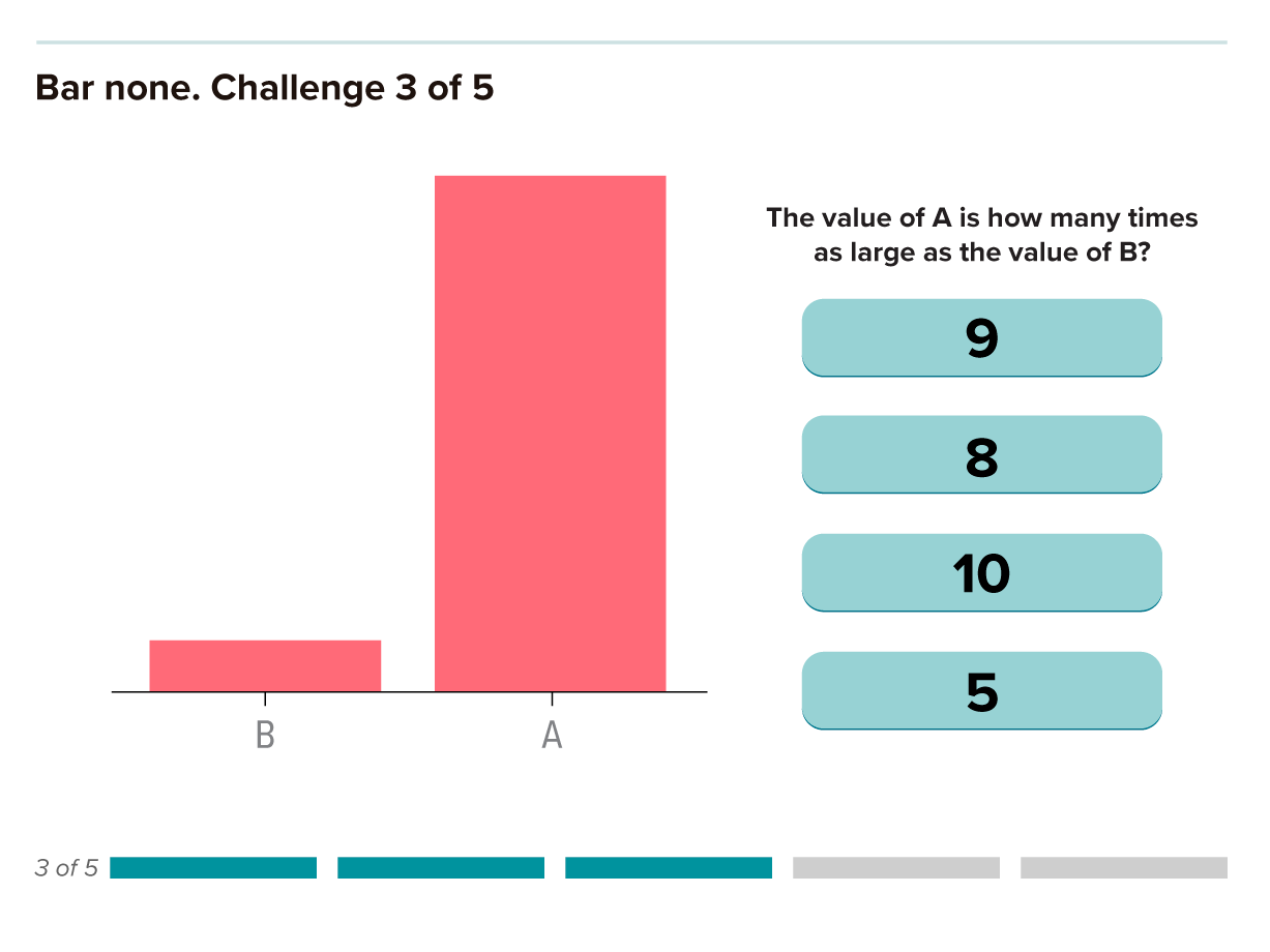
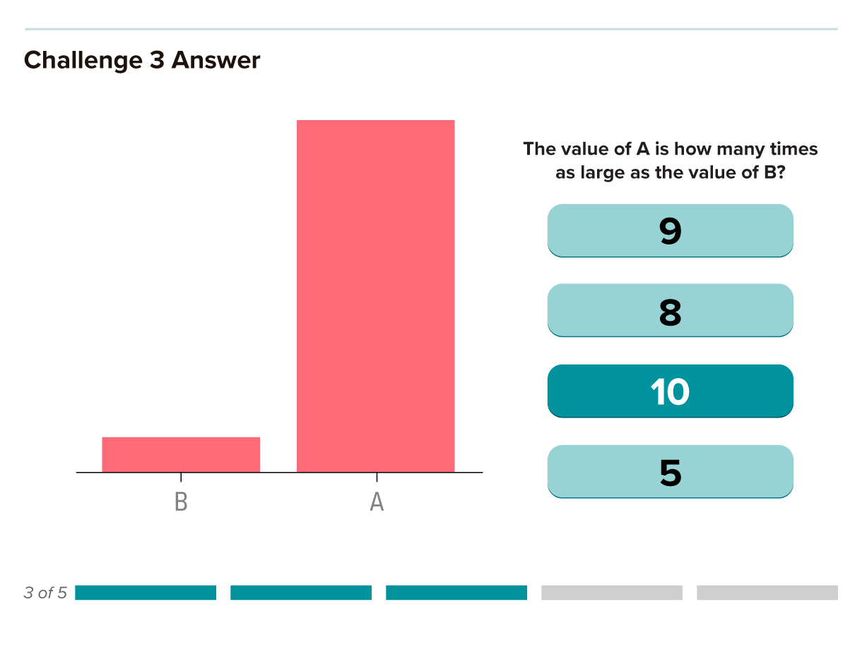
Their experiments showed that people are best at reading charts based on the lengths of bars or lines, such as in a standard bar chart. These visualizations are the best choice when it’s important to accurately discern small differences between values.
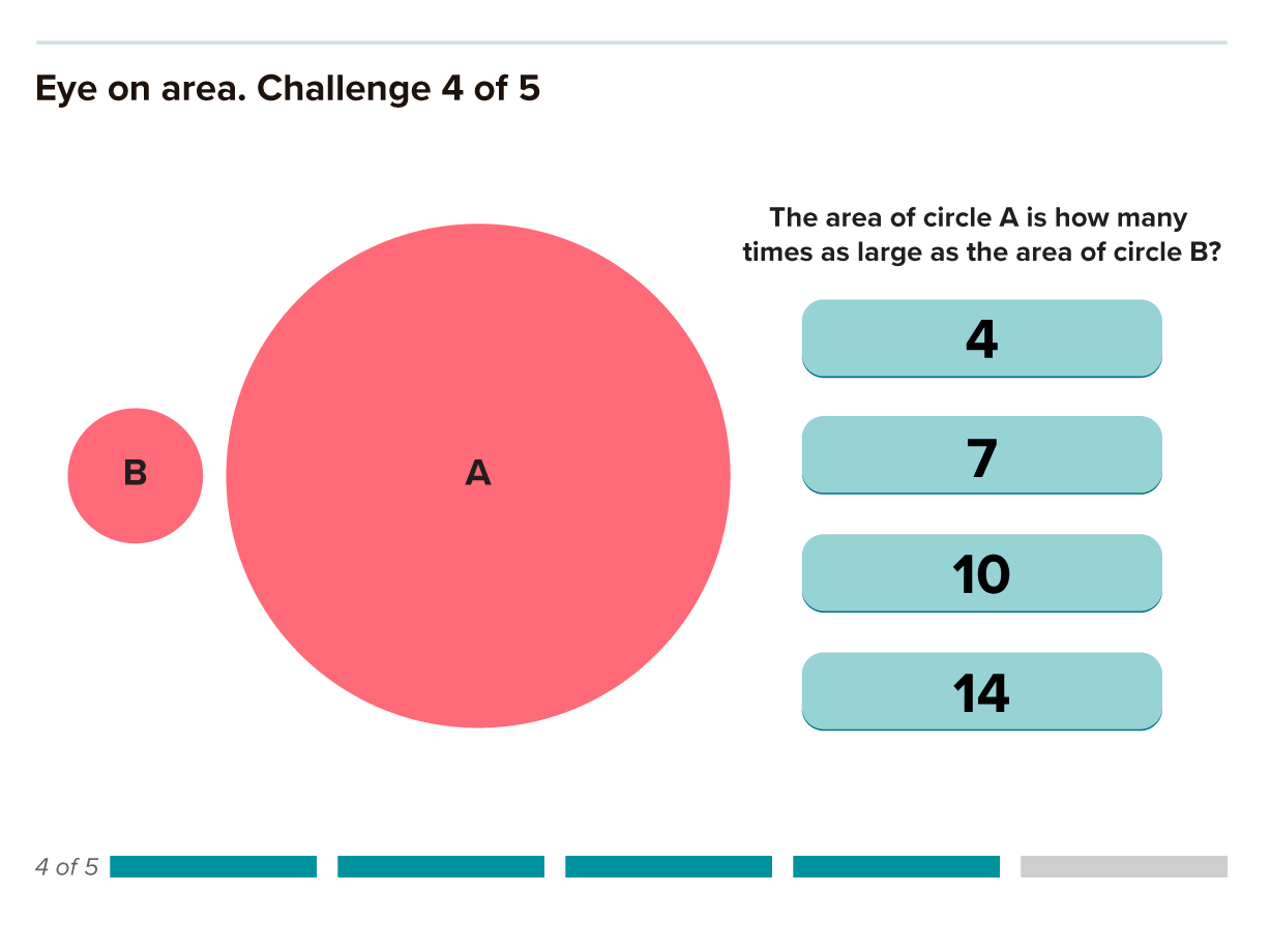
Study participants found it somewhat harder to judge differences in direction, angle and area. Figures using volume, curvature or shading to represent data were even tougher. And the least effective method of all was color saturation.
“The ability of the audience to perceive minute differences is going to get worse and worse” as you move down the list, says computer scientist Jeffrey Heer of the University of Washington in Seattle. In general, it’s best practice to use the highest graphical element on the list that meets the needs of each type of data.
For example, if it’s important to show that one particular disease is far more lethal than others, a graphic using the size of circles to represent the numbers of deaths will do fine. But to emphasize much smaller differences in the numbers of deaths among the less-lethal diseases, a bar chart will be far more effective.
In 2010, Heer used Amazon’s Mechanical Turk crowdsourcing service to confirm that Cleveland and McGill’s ranking holds true in the modern digital environment. Since then, Heer, O’Donoghue and others have used crowdsourcing to test many other aspects of visualization to find out what works best. “That has huge power going forward to take this whole field and really give it a solid engineering basis,” O’Donoghue says.
Pernicious pies
Cleveland and McGill’s graphical ranking highlights why some popular types of figures aren’t very effective. A good example is the ever-popular pie chart, which has earned the disdain of data visualization experts like Edward Tufte. In his influential 1983 treatise, The Visual Display of Quantitative Information, Tufte wrote that “the only design worse than a pie chart is several of them.”
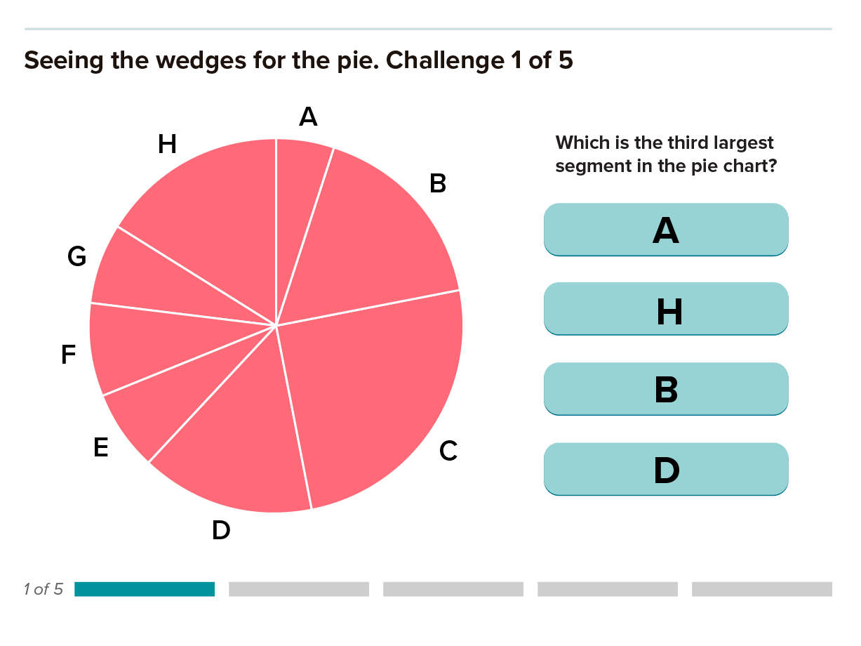
Pie charts are often used to compare parts of a whole, a cognitively challenging visual task. The reader needs to judge either differences between the areas of the pie slices, or between the angles at the center of the chart: Both types of estimations are more difficult than discerning the difference in lengths of bars on a bar chart, which would be a better option in many instances.
Pie charts are best used to show the relationship of the pieces to the whole. In this graphic, the pie chart effectively shows how big or small each economic sector’s contribution is to total greenhouse gas emissions, but it’s difficult to compare sectors with each other. The bar chart allows for easy comparisons between sectors but doesn’t convey how each one relates to the total.
Pie charts can be tempting because they are generally more attractive than bar charts, are easy to fill with colors and are simple to make. But they are rarely the best choice and are acceptable only in limited contexts. If the goal is to show that the parts add up to a whole, or to compare the parts with that whole (rather than comparing slices with each other), a well-executed pie chart might suffice as long as precision isn’t crucial.
For example, a pie chart that depicts how much each economic sector contributes to greenhouse gas emissions nicely shows that around half come from electricity and heat production along with agriculture, forestry and other land use. Transportation, which often gets the most attention, makes up a much smaller piece of the pie. Putting six bars next to each other in this case doesn’t immediately show that the parts add up to 100 percent or what proportion of the whole each bar represents.
In some scientific disciplines, the pie chart is simply standard practice for displaying specific types of data. And it’s hard to buck tradition. “There are certain areas in epigenetics where we have to show the pie chart,” says Wong, who works with biomedical scientists at the Broad Institute to create better visualizations. “I know the shortcomings of a pie chart, but it’s always been shown as a pie chart in every publication, so people hold on to that very tight.”
In other instances, the extra work pies ask of the human brain makes them poor vehicles for delivering accurate information or a coherent story.
We’re confronted daily with staggering new data from this unprecedented pandemic. The data, presented in charts, graphs, maps, and animations, can be overwhelming and also hard to grasp. We asked two data visualization researchers for their advice on reading a few of the most common COVID-19 charts. In the video they share what these graphs can and cannot tell us about the pandemic.
PRODUCED BY TIEN NGUYEN FOR KNOWABLE MAGAZINE
Behind bars
Though bar graphs are easy to read and understand, that doesn’t mean they’re always the best choice. In some fields, such as psychology, medicine and physiology, bar graphs can often misrepresent the underlying data and mask important details.
“Bar graphs are something that you should use if you are visualizing counts or proportions,” says Tracey Weissgerber, a physiologist at the Mayo Clinic in Rochester, Minnesota, who studies how research is done and reported. “But they’re not a very effective strategy for visualizing continuous data.”
Weissgerber conducted a survey of top physiology journals in 2015 and found that some 85 percent of papers contained at least one bar graph representing continuous data — things like measurements of blood pressure or temperature where each sample can have any value within the relevant range. But bars representing continuous data can fail to show some significant information, such as how many samples are represented by each bar and whether there are subgroups within a bar.
Every one of the four sets of data on the right can be accurately represented by the same bar graph on the left, illustrating how bar graphs can obscure important details about the data, possibly misleading readers.
For example, Weissgerber notes that the pregnancy complication preeclampsia can stem from problems with the mother or from problems with the baby or placenta. But within those groups are subgroups of patients who arrive at the same symptoms through different pathways. “We’re really focused on trying to understand and identify women with different subtypes of preeclampsia,” Weissgerber says. “And one of the problems with that is if we’re presenting all of our data in a bar graph, there are no subgroups in a bar graph.”
Bar charts are especially problematic for studies with small sample sizes, which are common in the basic biomedical sciences. Bars don’t show how small the sample sizes are, and outliers can have a big effect on the mean indicated by the height of a bar.
“One of the challenges is that in many areas of the basic biomedical sciences, bar graphs are just accepted as ... how we show continuous data,” Weissgerber says.
Many types of graphs are better than bar charts for displaying continuous data. Scatterplots (top) give readers more detail about the data, revealing the sample size and whether there are outliers or clusters. Box plots (middle) are good for showing the variability of a dataset. Histograms (bottom) allow readers to evaluate the distribution of the data.
There are several good alternative graphs for small continuous data sets. Scatterplots, box plots and histograms all reveal the distribution of the data, but they were rarely used in the papers Weissgerber analyzed. To help correct this problem, she has developed tools to create simple scatterplots and various kinds of interactive graphs.
Ruinous rainbows
Color can be very effective for highlighting different aspects of data and adding some life to scientific figures. But it’s also one of the easiest ways to go wrong. Human perception of color isn’t straightforward, and most scientists don’t take the peculiarities of the visual system into account when choosing colors to represent their data.
One of the most common bad practices is using the rainbow color scale. From geology to climatology to molecular biology, researchers gravitate toward mapping their data with the help of Roy G. Biv. But the rainbow palette has several serious drawbacks — and very little to recommend it.
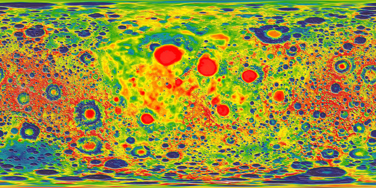
This map uses a rainbow color scale to show the variation in the moon’s gravitational pull. At first glance (and possibly second and third glances as well), it’s pretty difficult to interpret. Does blue indicate higher or lower gravity? How about red?
CREDIT: NASA’S GODDARD SPACE FLIGHT CENTER SCIENTIFIC VISUALIZATION STUDIO
Even though it’s derived from the natural light spectrum, the order of colors in the rainbow is not intuitive, says Wong. “You sort of have to think, is blue bigger than green? Is yellow larger than red?”
An even bigger problem is that the rainbow is perceived unevenly by the human brain. People see color in terms of hue (such as red or blue), saturation (intensity of the color), and lightness (how much white or black is mixed in). Human brains rely most heavily on lightness to interpret shapes and depth and therefore tend to see the brightest colors as representing peaks and darker colors as valleys. But the brightest color in the rainbow is yellow, which is usually found somewhere in the middle of the scale, leading viewers to see high points in the wrong places.
The grayscale may look dull, but it is intuitive. It’s very clear how each individual shade on the scale relates to the others. This is not true for the rainbow scale, which is one of the reasons cartographers and data visualization experts avoid it.
CREDIT: 5W INFOGRAPHIC / KNOWABLE
Compounding the problem, the transitions between some colors appear gradual, while other changes seem much more abrupt. The underlying data, on the other hand, usually have a consistent rate of change that doesn’t match the perceived unevenness of the rainbow. “You can have perceptual boundaries where none exist and also hide boundaries that do exist,” says climate scientist Ed Hawkins of the University of Reading in England. Even scientists can fall prey to this illusion when interpreting their own data.
To avoid the rainbow problem, some researchers have come up with mathematically based palettes that better match the perceptual change in their colors to changes in the corresponding data. Some of these newer color scales work specifically for people with red-green color blindness, which is estimated to affect around 8 percent of men (but only a tiny fraction of women).
Though cartographers and a few scientists like Hawkins have been railing against the rainbow for decades, it remains pervasive in the scientific literature. Some fields of science have probably been using it ever since color printing was invented. And because many scientists aren’t aware of the problematic aspects of the rainbow, they see no reason to defy tradition. “People are used to using it, so they like it, they feel comfortable with it,” Hawkins says.
A microscopic image of yeast cells rendered with different color scales highlights the counterintuitive nature of the rainbow scale. Both the viridis and cividis color scales are intended to better represent the underlying data and are easier to read. Cividis was specifically designed to be legible for color-blind people as well.
This inclination is also encouraged by the fact that the rainbow color scale is the default for much of the software scientists use to create visualizations. But Hawkins and others have been pushing software makers to change their defaults, with some success.
In 2014, MathWorks switched the default for the MATLAB software program to an improved color scheme called parula. In 2015 a cognitive scientist and a data scientist developed a new default color scheme called viridis for making plots with the popular Python programming language. And a new mathematically derived color scheme called cividis has already been added to a dozen software libraries, though it is not yet the default on any of them.
Hazardous heat maps
One of the most interesting quirks of the human visual system — and one of the most nettlesome for data visualization — is that our perception of a color can be influenced by other nearby colors. In some cases the effect is quite dramatic, leading to all sorts of optical illusions.
Whenever a visualization places different colors, or even shades of the same color, next to each other, they can interact in unintended ways. The exact same color will look entirely different when surrounded by a darker shade than it looks when surrounded by a lighter shade, a phenomenon known as simultaneous contrast. A well-known illustration of this, the checker shadow illusion, plays with the brain’s interpretation of colors when a shadow is cast across a checkered grid.
The rectangles in this image are all the exact same shade of gray but look vastly different depending on the color that surrounds them. This phenomenon, known as simultaneous contrast, can cause readers to misinterpret the values represented by colors on a graphic.
“The effect of color interactions poses a huge problem,” Wong says. In the life sciences, one pervasive example is the heat map, which is often used to reveal relationships between two sets of data. “If you flip through a journal, a third of the figures are heat maps,” he says. “This is a very popular form of data visualization that in fact is biasing scientific data.”
A heat map is a two-dimensional matrix, basically a table or grid, that uses color for each square in the grid to represent the values of the underlying data. Lighter and darker shades of one or more hues indicate lower or higher values. Heat maps are especially popular for displaying data on gene activity, helping researchers identify patterns of genes that are more or less actively producing proteins (or other molecules) in different situations.
The two starred squares on this heat map are identical shades of orange, indicating identical values in terms of gene activity. But differences in the color of neighboring squares means that the starred ones don't look identical, which can be misleading.
Heat maps are great for packing a ton of data into a compact display. But putting various shades of colors right next to each other can trigger the simultaneous contrast illusion. For example, a scientist comparing the colors of individual squares in the grid can easily misinterpret two different shades of orange as being the same — or think that two identical shades are quite different — depending on the colors of the surrounding squares.
“This is a huge problem in heat maps where you’re relying on a bunch of color tiles sitting next to each other,” Wong says. “This unintentional bias is sort of rampant in every heat map.”
For gene activity data, green and red are often used to show which genes are more or less active. A particular shade of green can look very different surrounded by lighter shades of green compared with when it is surrounded by darker shades of green, or by red or black. The value that the shade of green is representing is the same, but it will appear higher or lower depending on its neighboring squares.
Heat maps use color to track relative gene activity across samples. Green indicates more activity, with brighter green denoting greater activity. Red shows genes that are less active. On this map, most of the bright green activity is clustered in the upper left corner. Near the center of the map one bright green square indicates potentially important activity. But that square looks bright only relative to the surrounding black squares. It’s actually the same color as the less bright green squares in the cluster.
A blob of bright green squares in one part of the grid might mean that a gene is highly active in a group of closely related subspecies, say of bacteria. At the same time in another part of the grid, a single dull-green square surrounded by black squares may look bright, making it appear that the same gene is highly active in an unrelated bacterium species, when in fact it is only weakly active.
One way to mitigate the problem, Wong says, is to introduce some white space between parts of the grid, perhaps to separate groups of related species, groups of samples or sets of related genes. Breaking up the squares will reduce the interference from neighboring colors. Another solution is to use an entirely different display, such as a graph that uses lines to connect highly active genes, or a series of graphs that represent change in gene activity over time or between two experimental states.
Muddled messaging
Making sure a visualization won’t mispresent data or mislead readers is essential in sharing scientific results. But it’s also important to consider whether a figure is truly drawing attention to the most relevant information and not distracting readers.
For example, the distribution of many data sets when plotted as a line graph or a histogram will have a bell shape with the bulk of the data near the center. “But often we care about what’s on the tails,” Wong says. For the viewer, “that’s often overwhelmed by this big old thing in the middle.”
The solution could be to use something other than height to represent the distribution of the data. One option is a bar code plot, which displays each value as a line. On this type of graph, it is easier to see details in areas of low concentration that tend to all but disappear on a bell curve.
A bell curve draws attention to the distribution of the bulk of the data. But sometimes what’s really important is what’s on the edges of the data. In that case, a bar code graph may be a better choice. The graphs above show the dependency of cell lines on the gene FOXA1; those to the left of the minus-1 reference line need the gene to survive. Those cell lines are difficult to see on the bell curve, but stand out on the bar code.
Thoughtfully applied color can also enhance and clarify a graphic’s message. On a scatterplot that uses different colors to identify categories of data, for instance, the most important information should be represented by the colors that stand out most. Graphing programs may just randomly assign red to the control group because it’s the first column of data, while the interesting mutant that is central to the findings ends up colored gray.
“Pure colors are uncommon in nature, so limit them to highlight whatever is important in your graphics,” writes data visualization journalist Alberto Cairo in his 2013 book The Functional Art. “Use subdued hues — grays, light blues, and greens — for everything else.”
Besides the rainbow and simultaneous contrast, there are plenty of other ways to get into trouble with color. Using too many colors can distract from a visualization’s main message. Colors that are too similar to each other or to the background color of an image can be hard to decipher.
Colors that go against cultural expectations can also affect how well a reader can understand a figure. On maps that show terrain, for example, the expectation is that vegetation is green, dry areas are brown, higher elevations are white, cities are gray, and of course water is blue. A map that doesn’t observe these well-established color schemes would be much harder to read. Imagine a US electoral map with Democratic areas shown in red and Republican areas in blue, or a bar chart showing different causes of death in bright, cheery colors — the dissonance would make it harder to absorb their message.
Readers have culturally defined expectations about what different colors mean. Violating such expectations makes graphs, maps and other illustrations more difficult to decipher, as this color-shifted relief map of the United States demonstrates.
If color isn’t necessary, sometimes it’s safest to stick with shades of gray. As Tufte put it in his 1990 book Envisioning Information, “Avoiding catastrophe becomes the first principle in bringing color to information: Above all, do no harm.”
Visualize the future
Many data visualization problems persist because scientists simply aren’t aware of them or aren’t convinced that better figures are worth the extra effort, O’Donoghue says.
He’s been working to change this situation by initiating and chairing the annual Vizbi conference focused on visualizing biological science, teaching a visualization workshop for scientists, and combing the literature for evidence of the best and worst practices, which are compiled into his 2018 Annual Reviews paper. But overall, he says, the effort hasn’t gained a lot of momentum yet. “I think we’ve got a long ways to go.”
One reason for the lack of awareness is that most scientists don’t get any training in data visualization. It’s rarely required of science graduate students, and most institutions don’t offer classes designed on scientific visualization. For many students, particularly in the biomedical sciences, their only exposure to data visualization is in statistics courses that aren’t tailored to their needs, Weissgerber says.
Scientists also tend to follow convention when it comes to how they display data, which perpetuates bad practices.
One way to combat the power of precedent is by incorporating better design principles into the tools scientists use to plot their data (such as the software tools that have already switched from the rainbow default to more perceptually even palettes). Most scientists aren’t going to learn better visualization practices, O’Donoghue says, “but they’re going to use tools. And if those tools have better principles in them, then just by default they will [apply those].”
Scientific publishers could also help, he says. “I think the journals can play a role by setting standards.” Early-career scientists take their cues from more experienced colleagues and from published papers. Some journals, including PLoS Biology, ELife and Nature Biomedical Engineering have already responded to Weissgerber’s 2015 work on bar graphs. “In the time since the paper was published, a number of journals have changed their policies to ban or discourage the use of bar graphs for continuous data, particularly for small data sets,” she says.
With scientific data becoming increasingly complex, scientists will need to continue developing new kinds of visualizations to handle that complexity. To make those visualizations effective — for both scientists and the general public — data visualization designers will have to apply the best research on humans’ visual processing in order to work with the brain, rather than against it.
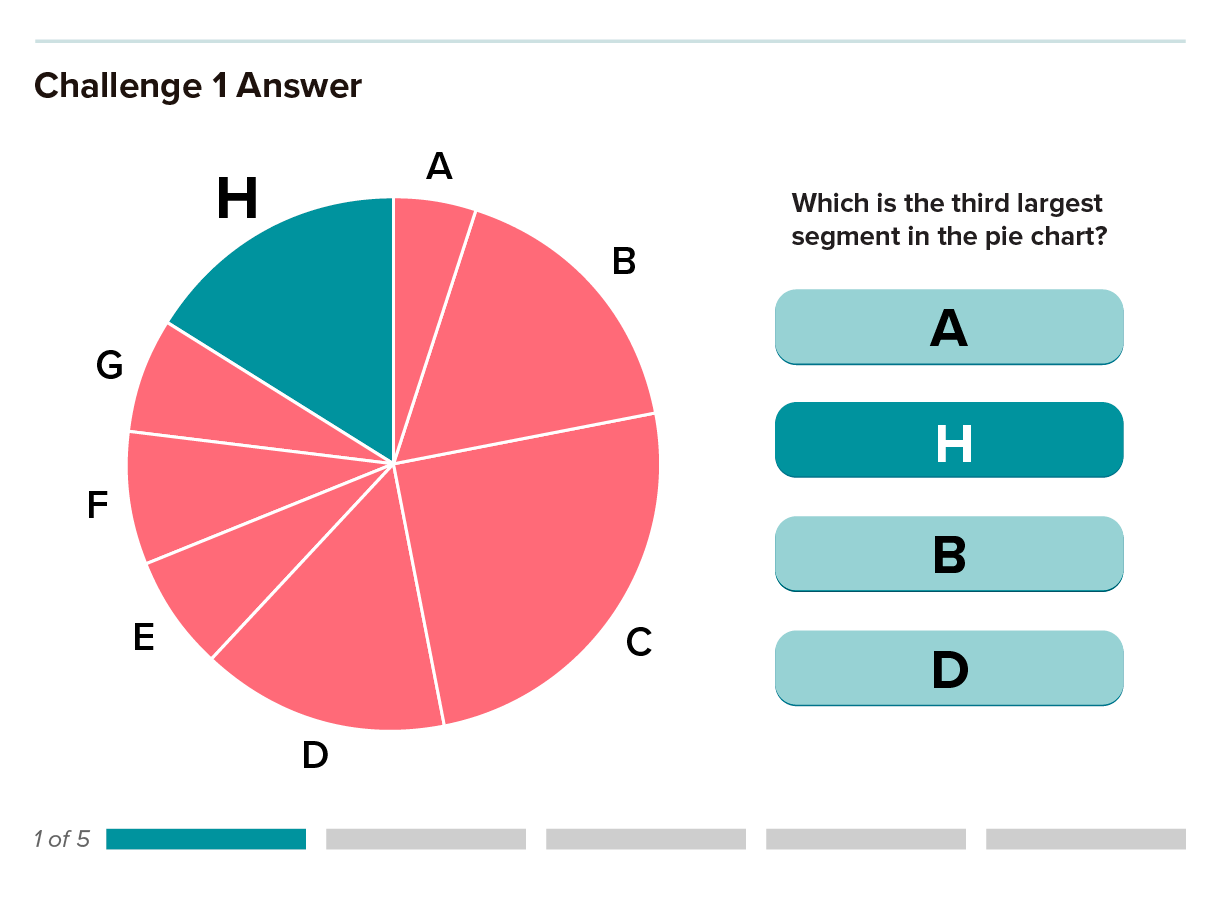
Editor’s note: A graphic on the “Chart challenge” slide show was corrected on November 14, 2019. The correct answer to the first challenge was pie wedge H, not B as originally indicated. Thanks to our perceptive readers for alerting us to the problem.
Editor’s note: On November 19, 2019, the “Ranking of visual elements” graphic was updated to add the “position on a scale” visualization and clarify the sources to add the Journal of the American Statistical Association attribution.


