If you think it’s hard to tell how you’re doing at your job, imagine being a hockey goalie. Let’s say you block every shot in a game. Was that performance due to your superior skills? Or maybe just to a lack of skill in your opponents?
Evaluating ice hockey players’ performance is getting easier, for goalies and their teammates. Advances in data collection — including video that can be slowed down and analyzed — and the application of more sophisticated statistics are allowing analysts to better assess how all players contribute to team performance on the ice. Among the more exciting outcomes are data-rich maps of the rink that can reveal especially successful shots or strategic passes.
“Back in the day, like decades ago, we could only really credit players for goals, and maybe assists and stuff like that,” says Namita Nandakumar, coauthor of a recent review of trends in hockey analytics in the Annual Review of Statistics and Its Application. “Now research shows that there are other aspects of the game that you can be consistently better or worse at.”

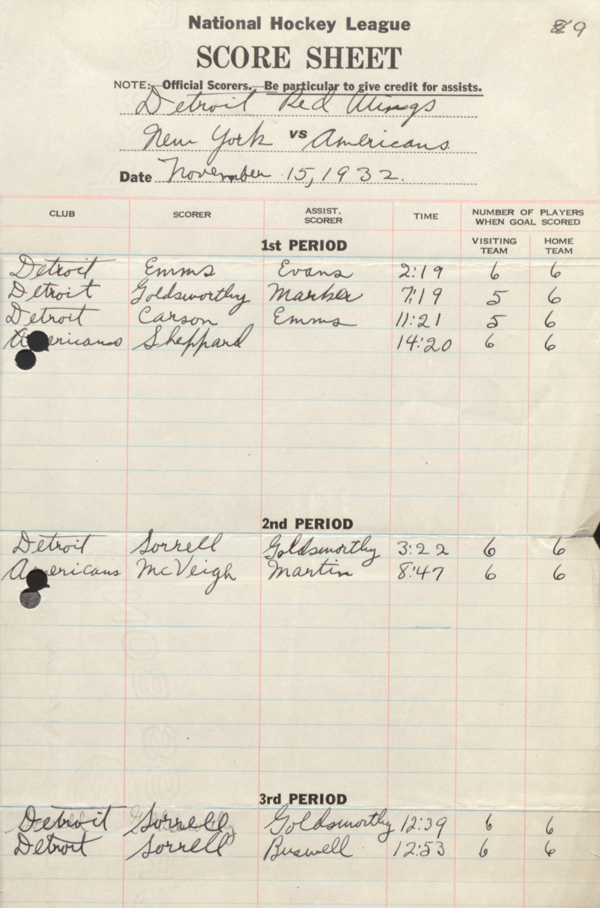
For many years, analyses of hockey players’ performance focused on who scored a goal, as seen in this NHL scoresheet from a 1932 game between the Detroit Red Wings and the New York Americans. (Those using the sheet are reminded to “be particular to give credit for assists.”) Scoring points is a very limited metric for evaluating performance; goals are relatively infrequent and goalies aren’t tasked with scoring.
CREDIT: © NHL
While the 2003 book Moneyball popularized sophisticated statistics called sabermetrics in baseball, hockey analytics has lagged behind. In a National Hockey League game, each team scores fewer than three goals on average over three 20-minute periods. With around 23 players on each team and six men normally on the ice at any one time, it’s hard to tease apart individual contributions to scores. Figuring out the best lineup for each situation depends on having those kinds of data.
Compared with baseball, “hockey is just inherently more difficult to analyze. It’s very fast, very continuous, not as discrete, and there’s just not as many scoring events in it,” says Shane Jensen, coauthor of the recent review and a statistician at the University of Pennsylvania’s Wharton School.
Historically, hockey analysts used stats such as “plus-minus,” which measures the difference between home goals and visitor goals when a player is on the ice. But those metrics couldn’t always distinguish a bad player with good teammates from a good player with bad teammates.
Today, analysts have access to much more fine-grained data. The NHL has digitized its statistics archive, making more than 100 years of historical data available online. Fans who contribute information to online databases while watching slowed-down video replays are adding to the data deluge.
These various performance-assessing strategies are bringing a revolution to hockey analytics, Jensen says, although most of the highest-resolution data is held closely as proprietary information by leagues and individual teams. “When I was first starting out in the field, we’d have these relatively small-scale historical data sets. Twenty years ago, I would’ve been blown away by the concept of working with terabytes of data.”
The masses of data have already improved evaluation of goalies, to whom plus-minus doesn’t apply. By amassing information on thousands of shots, including type, angle and distance from the goal, analysts can now calculate “expected goals” against a hypothetical goalie.
Data visualization has changed the landscape of hockey analytics in recent years, allowing analysts to customize strategies by opponent. This map shows zones where the St. Louis Blues were more likely (red) and less likely (blue) to shoot from during the 2018–19 season, as compared with the league average. The Blues took more shots from the slot (between the circles) than an average team.
CREDIT: MICAH BLAKE MCCURDY / HOCKEYVIZ.COM
If slap shots taken from a particular spot have gone in the net 10 percent of the time, for example, then an attempted shot of that type adds 0.1 to the expected goals of a game. Teams now evaluate goalies by comparing actual goals to expected goals in new stats called “goals saved above average” and “adjusted save percentage.”
“In general, letting in two goals, it’s not clear whether that is an amazing or an average or even a bad performance,” says Nandakumar, now an analyst for the National Football League’s Philadelphia Eagles. “But based on the expected goals, you can start to say, ‘OK, this is what an average goalie would have done, and this is what our goalie actually did.’”
Analysts can also make visualizations and create color-coded maps of the rink for each team to pinpoint spots where players have the highest probability of scoring against a particular opponent. These “danger zones” could clue in coaches and teams to more effective positioning during a game.
Such visualizations also help analysts better quantify assists and give credit to players who successfully pass the puck into a danger zone, regardless of whether a resulting shot turns into a goal. Before the rise of these maps, there was no way to record such passing attempts, which some people consider crucial for team success.

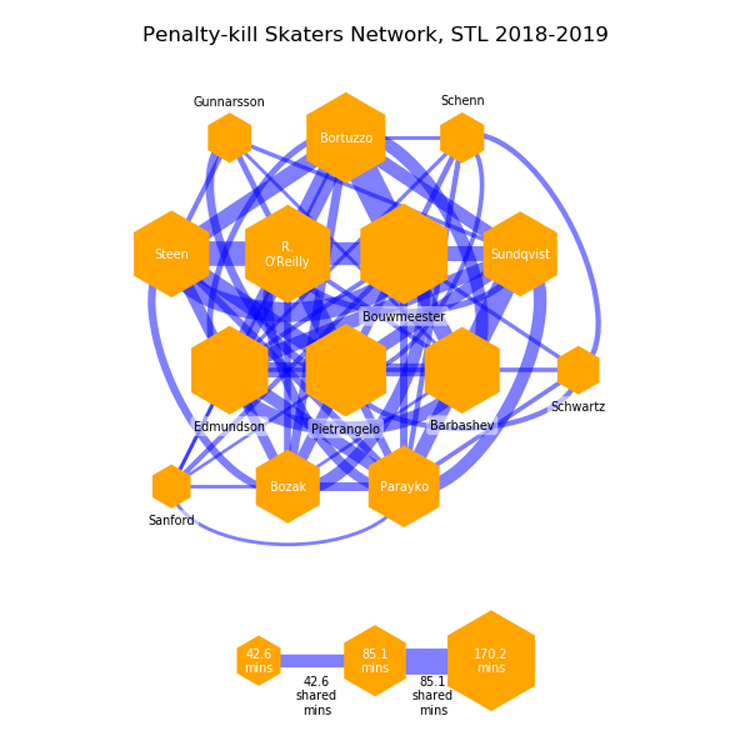
In one example of a new way to analyze hockey player performance, this data visualization shows how the 2019 NHL champions, the St. Louis Blues, defended against power plays. Data include how many minutes individual players were on the ice during penalty-killing situations (hexagons) and the player combinations (lines connecting hexagons). Blues coaches tended to use a rotating core of eight players (larger hexagons) during penalty kills, rather than organizing into two four-skater units.
CREDIT: MICAH BLAKE MCCURDY / HOCKEYVIZ.COM
“Over time, you see patterns that start to emerge,” says independent analyst and hockey coach Ryan Stimson, who led a project that harnessed dozens of volunteers to manually track which passes led to shot attempts in NHL games. “If you’re spending more time in certain areas, over the next 5 to 10 seconds, where are you more likely to get a shot from? We’re looking at where to literally move the puck to or stand with the puck.”
Coaches can use similar shot maps for individual opponents. For instance, they can anticipate where to place their defenders during a power play when one of their men is in the penalty box and the opponent has an advantage.
Enthusiastic amateurs are also contributing to the hockey visualizations game. After reading and contributing to hockey analytics blogs for years, history professor Benjamin Wendorf developed a data visualization that graphs teams’ cumulative shot attempts against time, which can show which team is dominating play at any given point during a game.
“I thought, ‘Wouldn’t it be snappy to see at what point the Jets took control of the game and were piling on the shots?’” says Wendorf. “The inspiration for some of this stuff comes out of weird places.”
With the sophistication of visualizations and evidence-based strategies, analysts hope their field will start to have an impact on how players and coaches make decisions beyond just goals and assists. Before data visualization, many of the metrics tossed about by enthusiasts seemed like inaccessible insider talk. But that’s gradually changing, Nandakumar says. “If you give them a shot chart that provides a level of accessibility, more so than a big scary table of numbers,” she says, “people can start to use it and accept it more.”


